Competitive benchmarking
Compared established hotel-booking journeys to understand familiar patterns, gaps and opportunities across search, results, rooms and payment.
04 / Case study
An evidence-led desktop experience shaped from competitive research and usability observation through journey mapping, interaction design and an interactive prototype.
01 / The brief
Booking a hotel asks users to compare location, price, reviews, facilities, room types, policies and extras before committing. The brief was not to decorate another travel website; it was to understand where confidence broke down and create a desktop journey that kept the right information visible at the right time.
02 / Research and synthesis
The project moved from observation to synthesis before any final UI decisions were made. Each stage narrowed a broad booking problem into a set of traceable design priorities.
Compared established hotel-booking journeys to understand familiar patterns, gaps and opportunities across search, results, rooms and payment.
Recorded structured notes from two usability sessions, separating what participants said from what their behaviour revealed.
Grouped individual observations into recurring themes so design priorities were based on patterns rather than isolated comments.
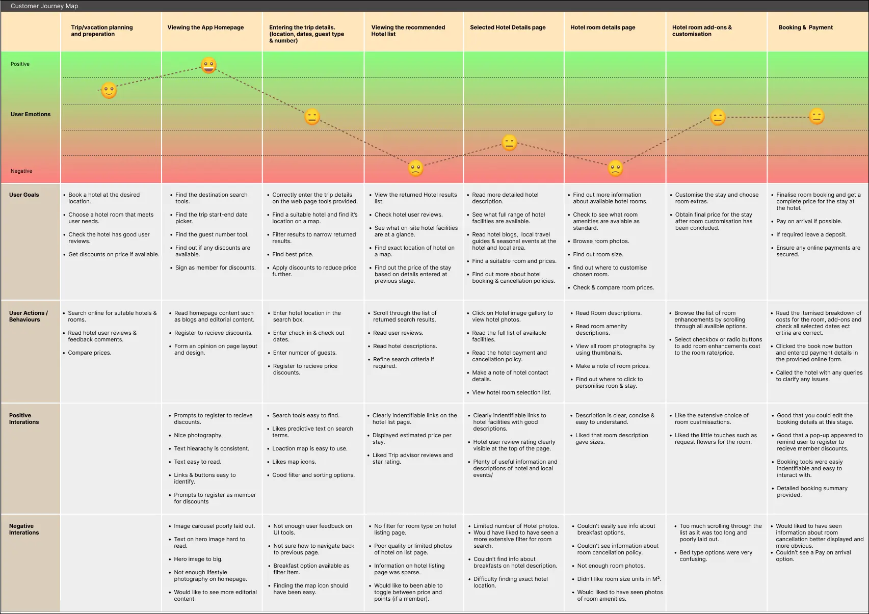
Mapped goals, actions, positive signals and friction from initial planning through hotel selection, room customisation and payment.
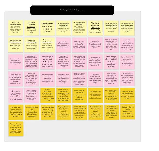
Individual observations were clustered, duplicates removed and related signals grouped until recurring themes became visible.
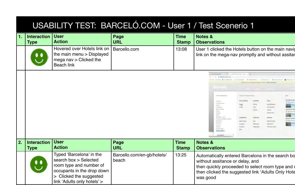
Sessions were captured as timestamped observation notes linking user actions, interface states and positive or negative interactions. Participant identity has been omitted.
03 / Customer journey
Confidence fell sharply while viewing results and room details. Those stages carried the heaviest comparison burden, so they became the centre of the design response rather than treating checkout as the only conversion problem.
04 / Findings
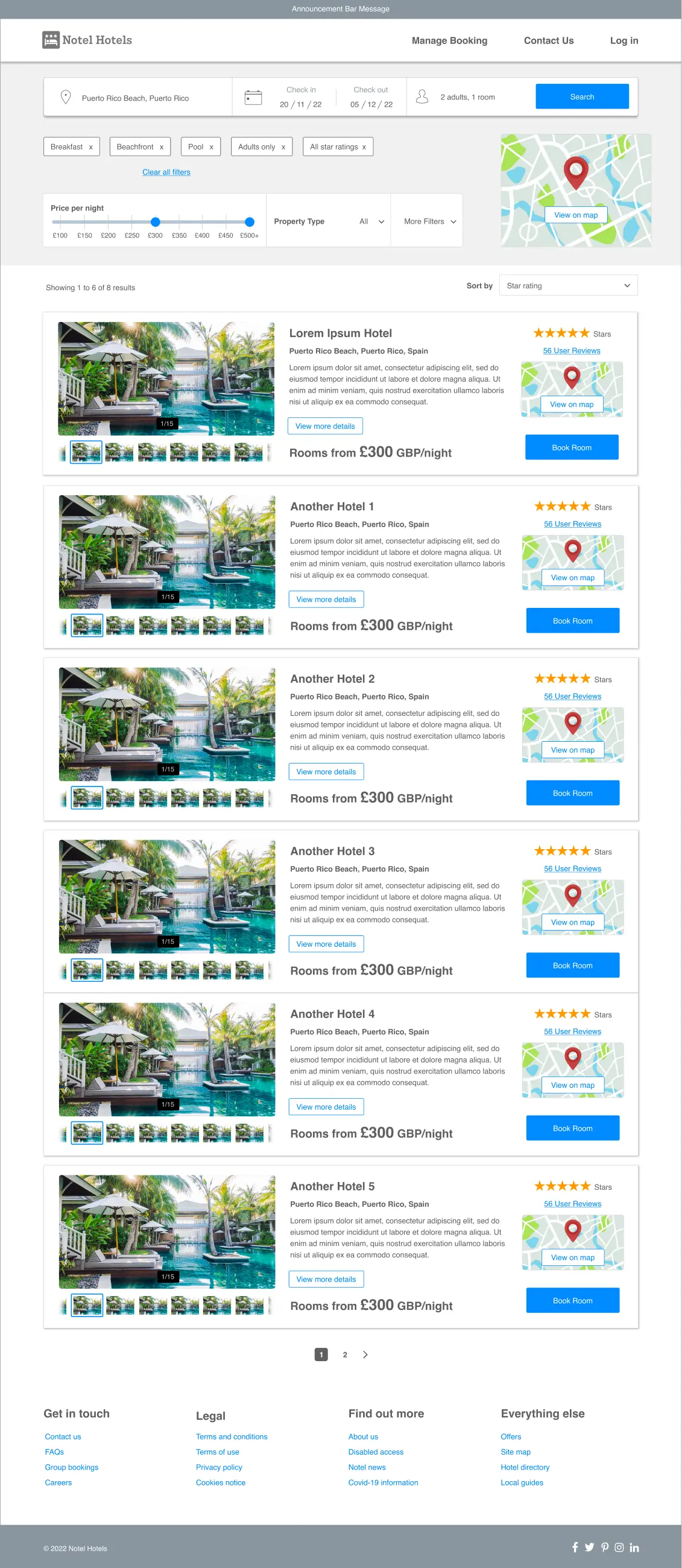
Participants valued filters and maps, but sparse listings and hard-to-find location information made comparison slower than it needed to be.
Breakfast, cancellation terms, room amenities and pay-on-arrival options were often difficult to locate at the moment they mattered.
Price, reviews, facilities and room information were distributed across the journey, forcing users to remember details between screens.
Long add-on choices and unclear bed options increased cognitive load near the end of an already demanding booking journey.
05 / Task flow
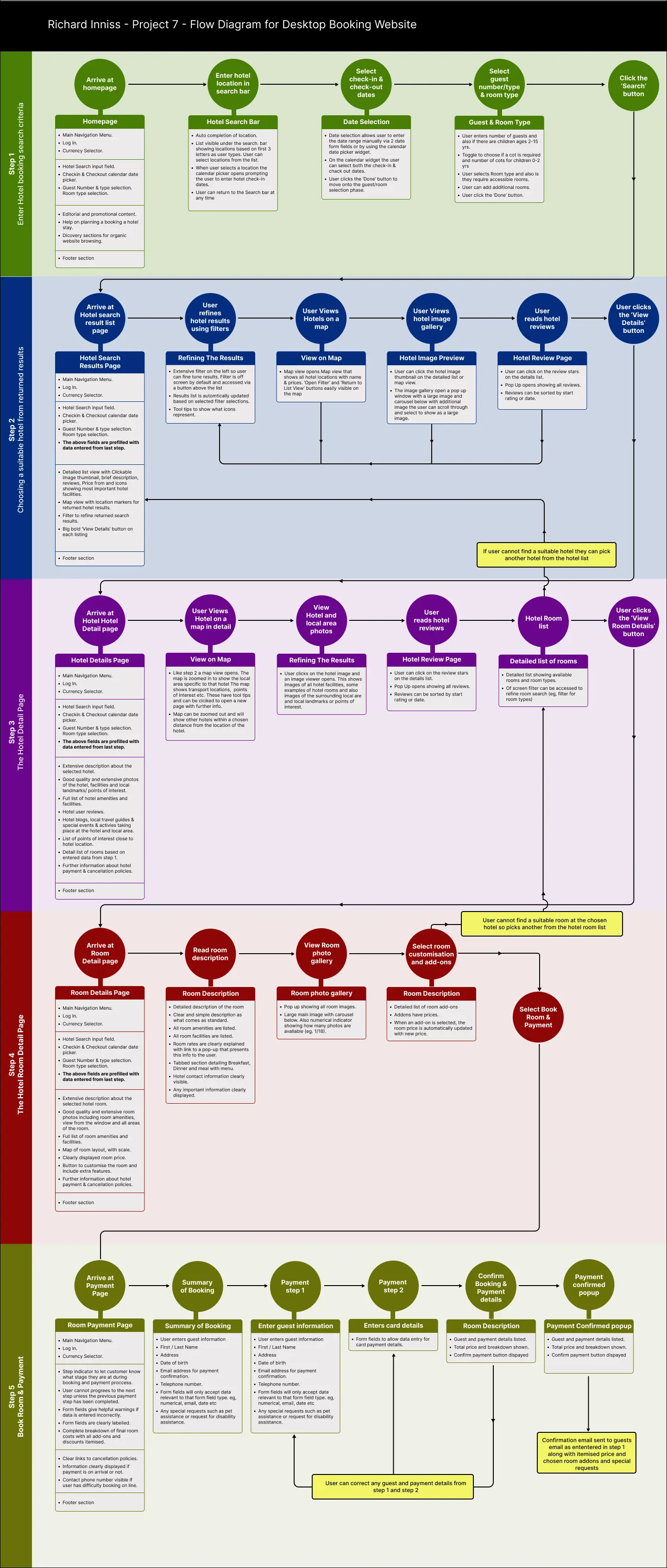
The desktop flow defined the main path and its recovery routes: entering trip criteria, refining results, evaluating a hotel, selecting a room and rate, adding extras, paying and confirming. This became the structural contract for the prototype.
06 / Interaction design
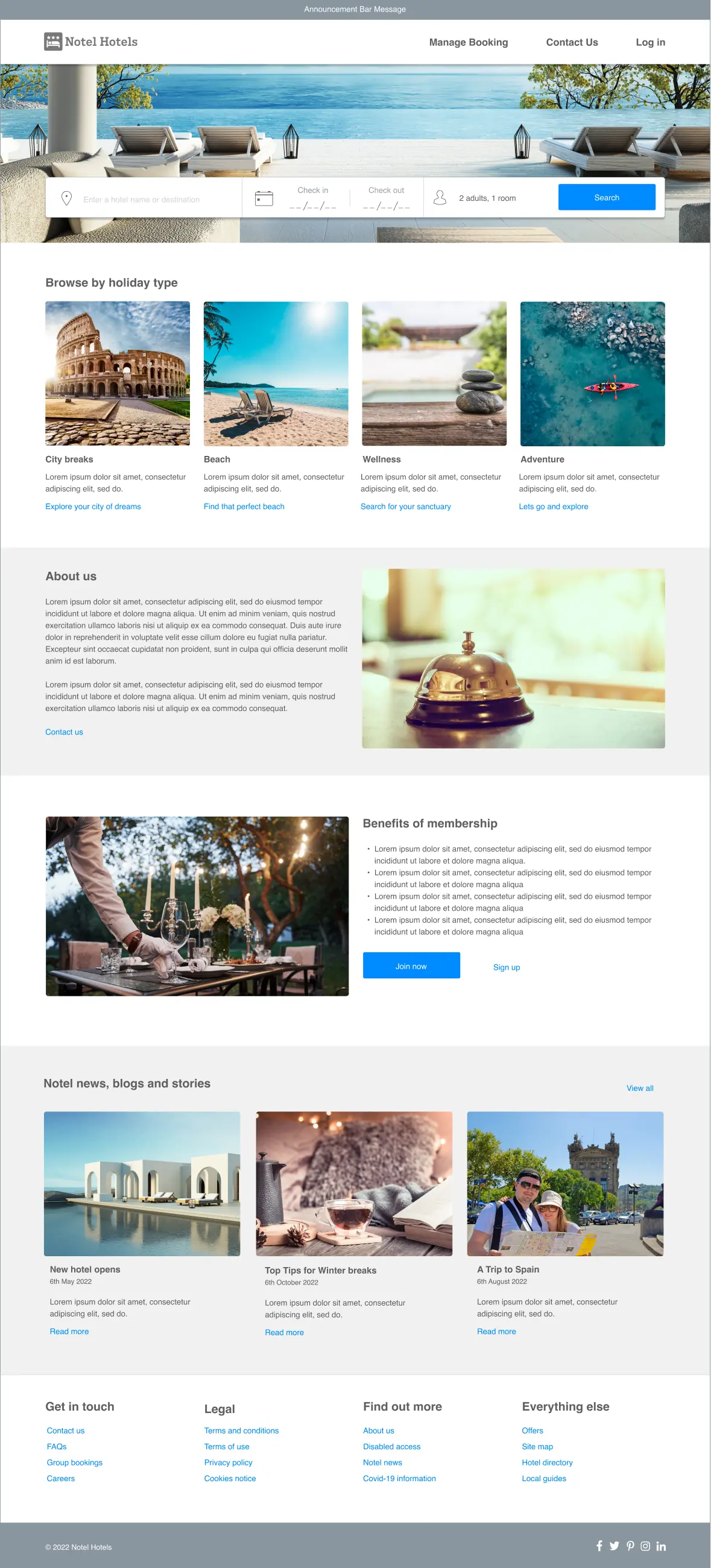
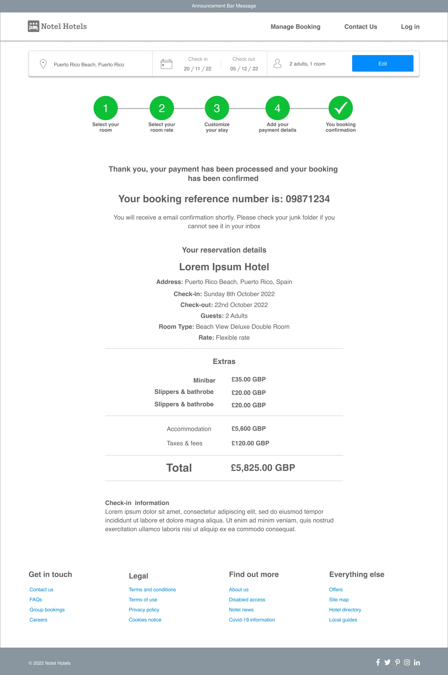
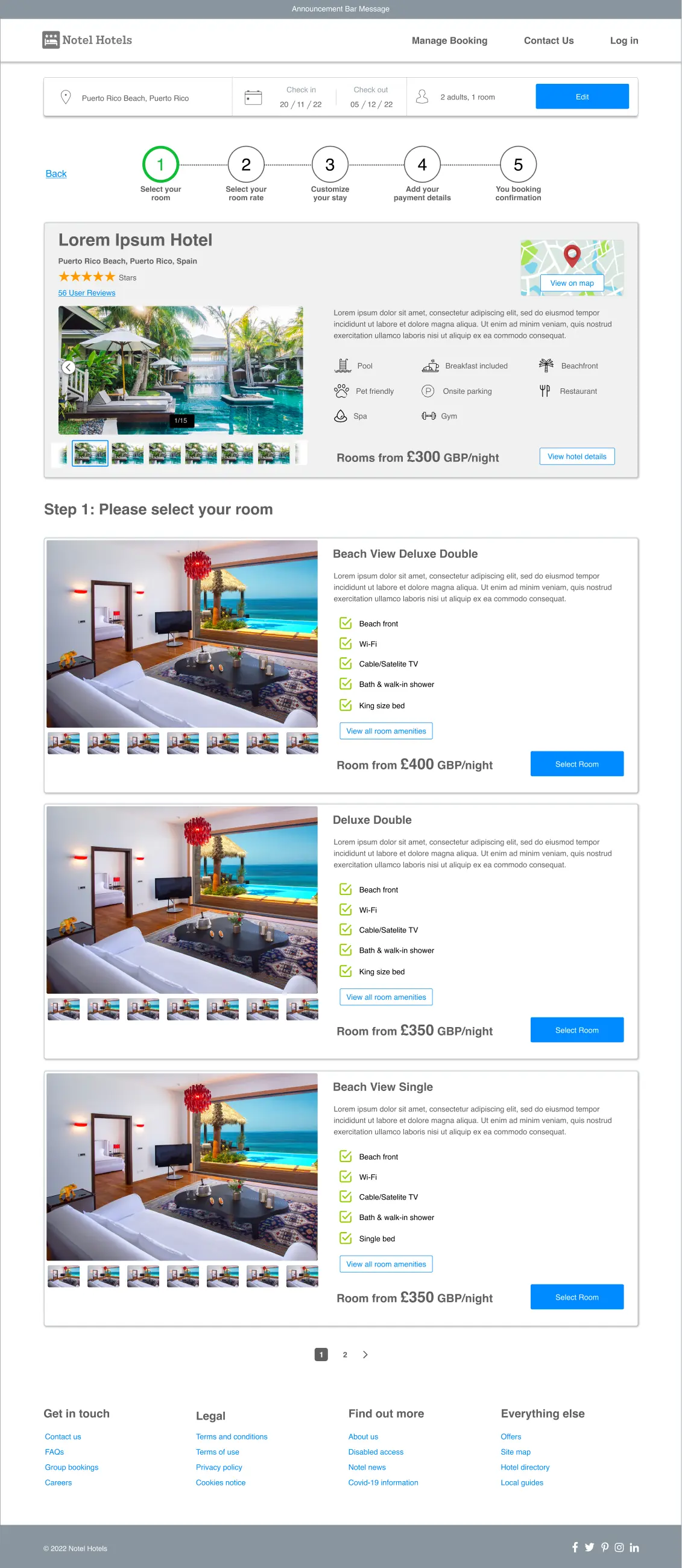
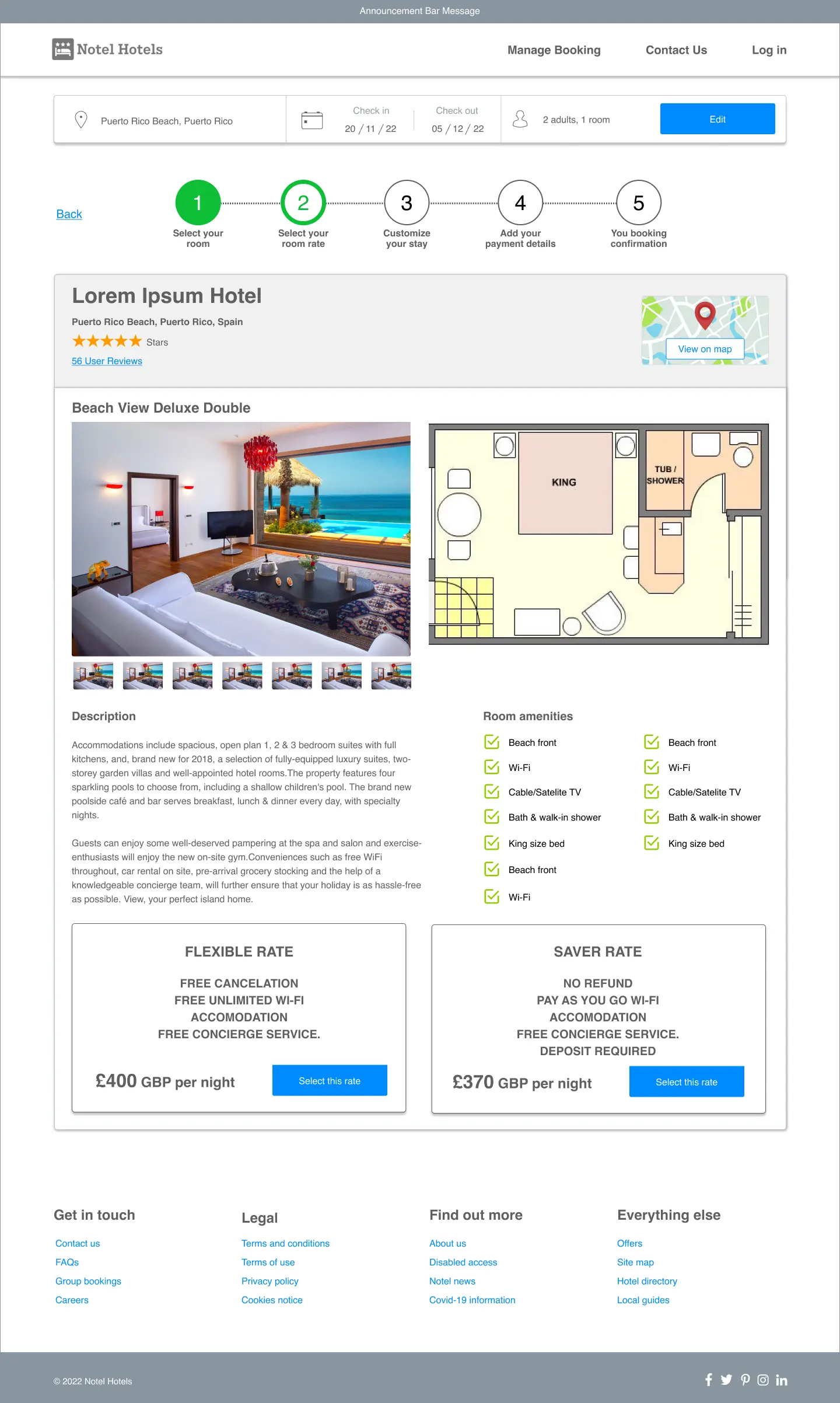
Search criteria remain visible, filters and map context work together, result cards carry the essentials for comparison and a staged booking model keeps progress and cost understandable as the user moves toward payment.
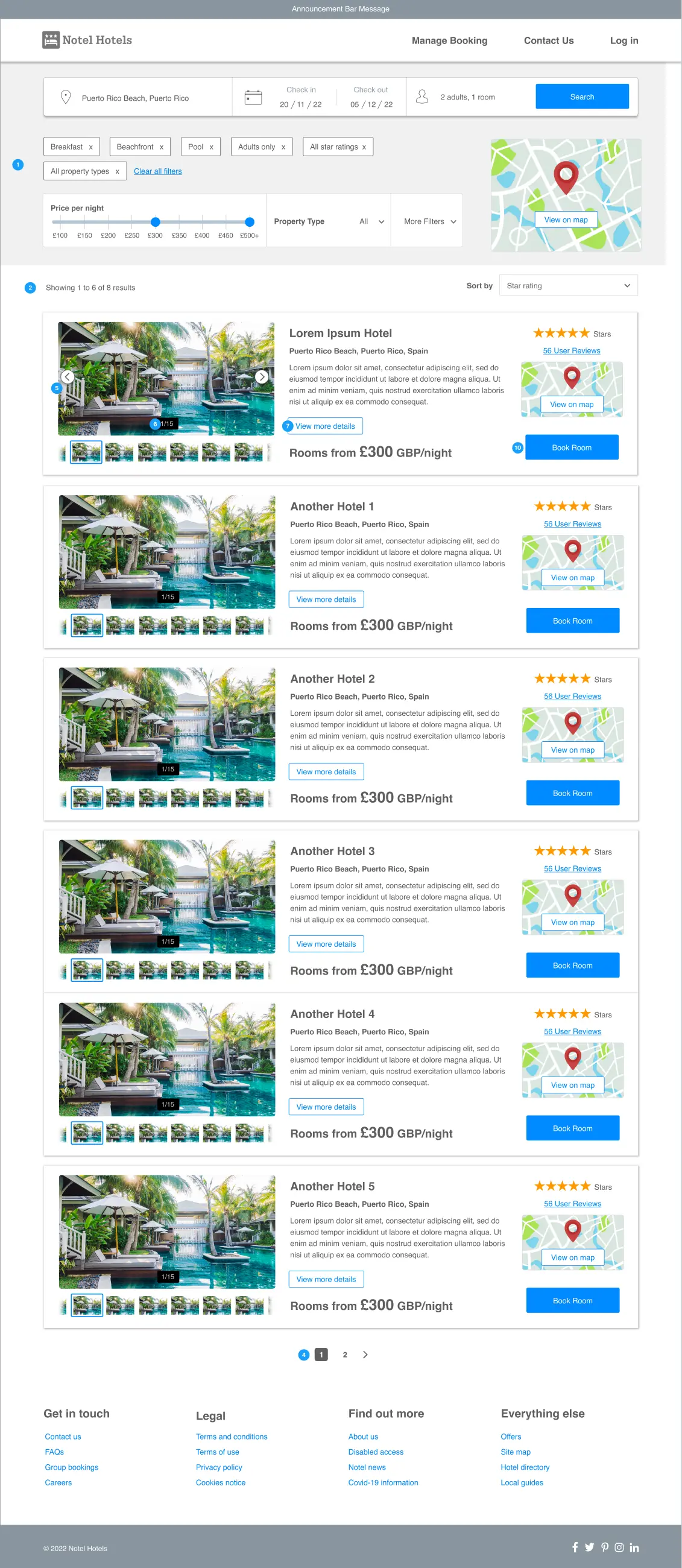
Location, dates and guests remain available for review and editing.
Filters, price, reviews, imagery and map access sit together on the results page.
Hotel, room, rate and extras are separated into focused decisions.
A visible booking sequence, itemised cost and final confirmation make the commitment explicit.
07 / Interactive prototype
The final Figma prototype contains fourteen exported states and interactive component variants for search, dates, guests, filters, map views, hotel detail, room choice, add-ons and payment.
08 / Outcome
This was an academic qualification project rather than a publicly launched commercial product. Its value is the evidence chain: raw observation became synthesised findings, findings became a journey and flow, and those structures became annotated designs and a working desktop prototype.