Clarify the primary action
Replace vague discovery language with specific, action-led calls to action and validate alternatives through testing.
01 / Case study
While I worked at Squashed Pixel, a leading Shopify and ecommerce design agency based in the North of England, I was tasked with designing Art Republic's ecommerce experience and collaborating with developers and project managers to connect artwork discovery, product reassurance and bespoke framing in one responsive system.

01 / Commercial context
Art Republic had been approached by Artfinder, a leading online art marketplace. The client commissioned a complete redesign to create a credible, fully realised digital product that could demonstrate the commercial value of the Art Republic proposition to a potential buyer. This was more than a visual refresh: the product, purchase journey and wider brand needed to feel coherent, mature and ready for market.
02 / UX and CRO requirements
The brief combined user experience design with conversion-rate optimisation: understand behaviour, remove friction and turn the strongest opportunities into testable product improvements.
03 / Research signal
“I'm literally just kind of scrolling through.”
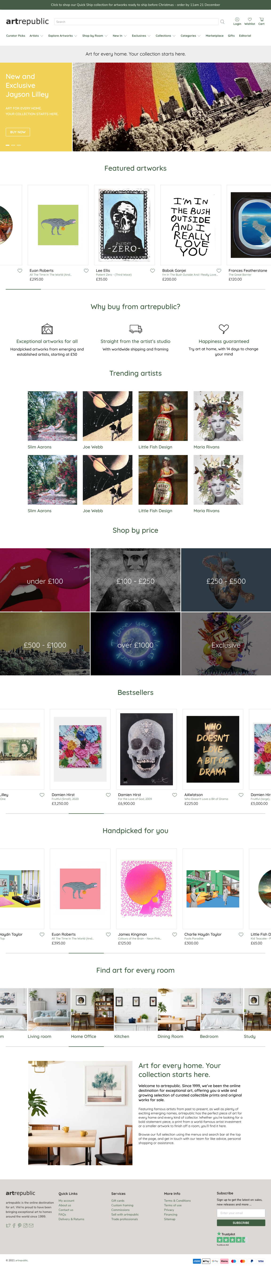
That observation became a useful signal. The site presented a large, visually rich catalogue, but quantity did not always create direction. Visitors needed meaningful entry points—artists, collections, editorial themes and reassurance—so browsing could become purposeful discovery.
CRO review / Priority actions
Replace vague discovery language with specific, action-led calls to action and validate alternatives through testing.
Bring the next useful action into view earlier and reduce avoidable scrolling before visitors can engage.
Replace undifferentiated volume with purposeful routes into artists, collections and editorial stories.
Combine observed behaviour with measurable hypotheses, testing and continued performance monitoring.
04 / Design principles
Editorial stories, popular collections and artist-led content give visitors a reason to continue rather than presenting one undifferentiated catalogue.
Disciplined typography, spacing and interface controls keep the art as the strongest visual element at every breakpoint.
Delivery, quality, framing and purchase confidence appear close to the decisions they support instead of arriving too late.
05 / Responsive discovery
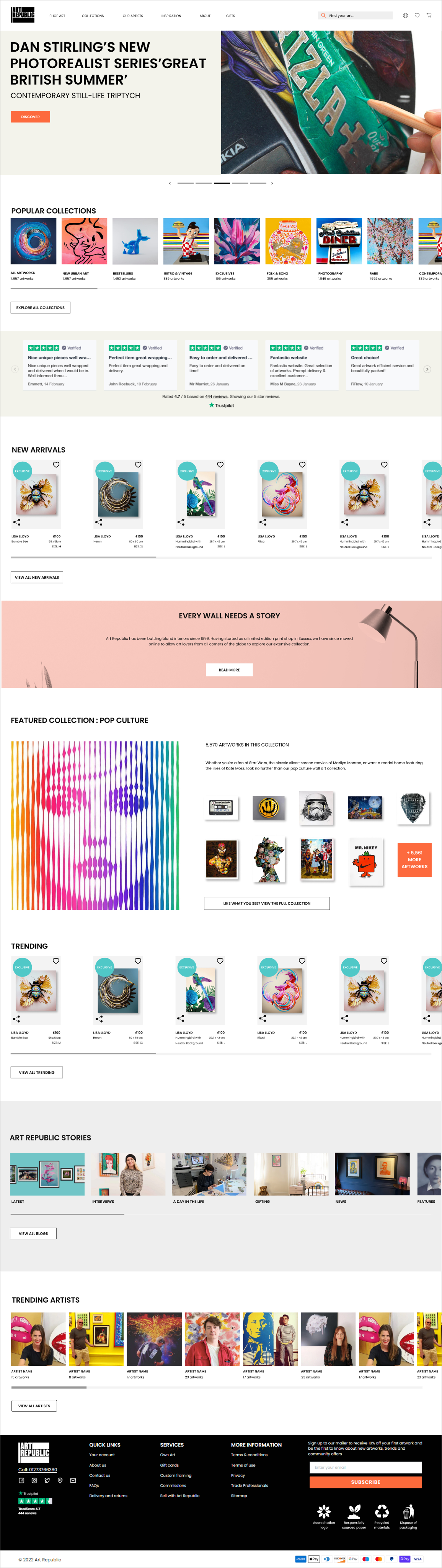
Desktop provides scale and theatre. Mobile preserves the same hierarchy, artwork and discovery rhythm without becoming a reduced copy of the larger experience.

06 / Key product feature
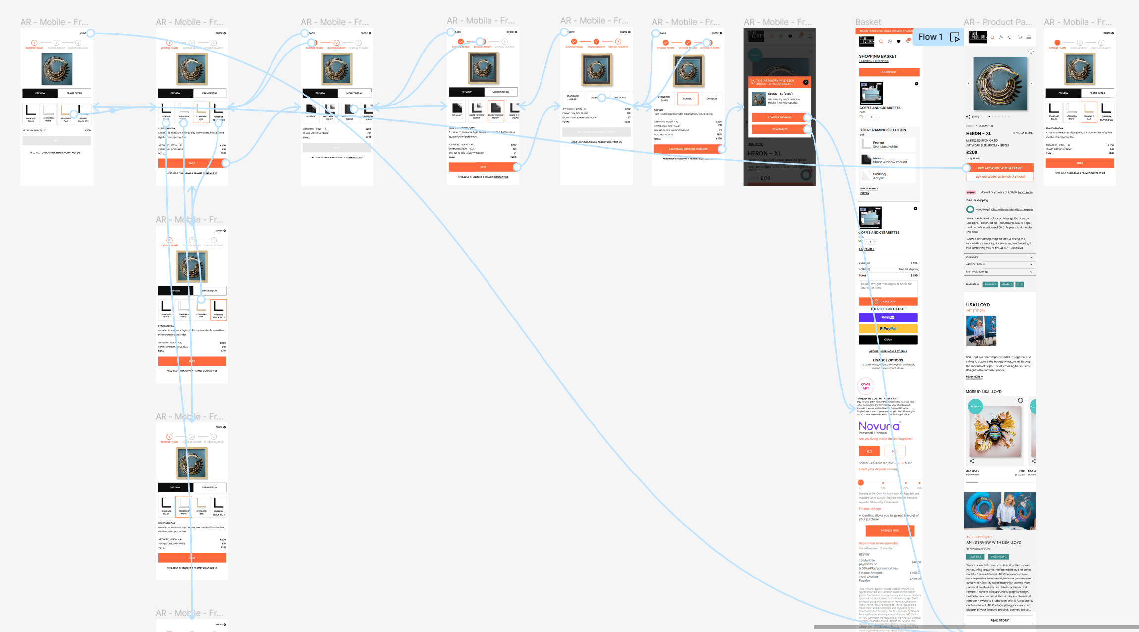
The Frame Builder breaks a specialist purchase into a short, visible sequence: frame, mount and glazing. A live artwork preview provides immediate feedback while price and selection details remain in context.

07 / Ecommerce ecosystem
Home, collection, artist and product pages each have a distinct purpose, but share one system of typography, spacing, colour and interaction. Visitors can move from inspiration to evaluation without losing orientation.

08 / Brand extension
The acquisition package also explored email, social media and a printed art-publication concept. These supporting applications were not publicly launched; they demonstrated how Art Republic could move beyond the website without losing its character.


09 / Process
Wireframes protected the journey before the gallery character of the final interface was introduced. Research, content hierarchy, interaction detail and responsive iteration moved together toward one coherent product.

10 / Outcome
The redesigned responsive ecommerce website and bespoke Frame Builder were launched publicly. Together they created a clearer model for discovery, a more understandable high-value framing decision and a consistent experience across the principal customer journeys.