Brand before template
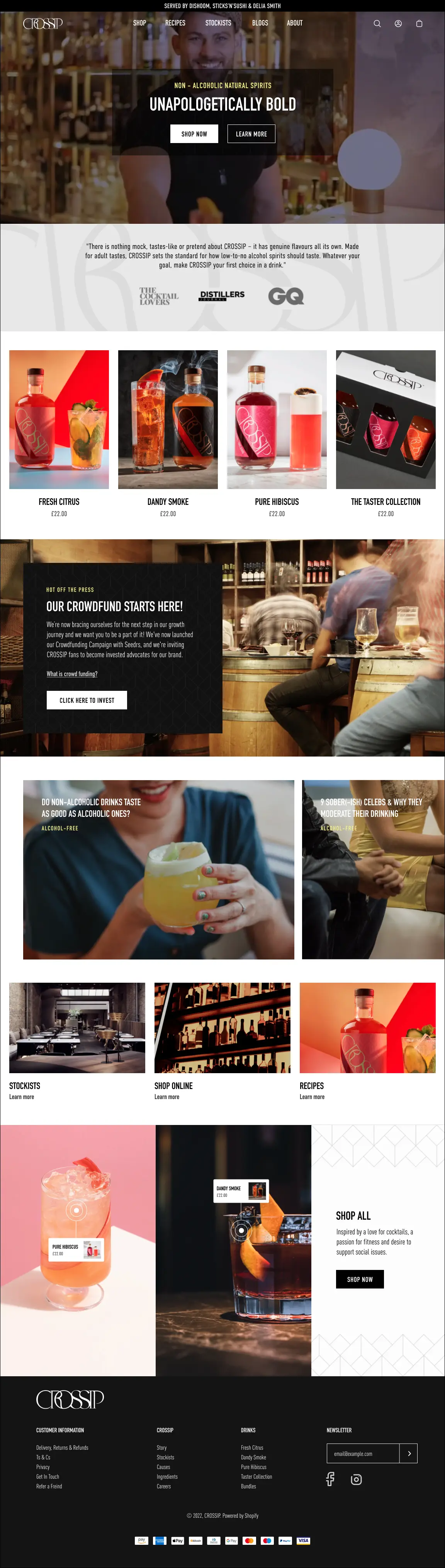
A high-contrast editorial language, condensed type and expressive pattern work prevent the storefront from feeling like an off-the-shelf theme.
01 / Case study
Lead UI/UX design for Crossip at Squashed Pixel—translating a bar-born alcohol-free drinks brand into a distinctive, responsive Shopify experience.
02 / The brand
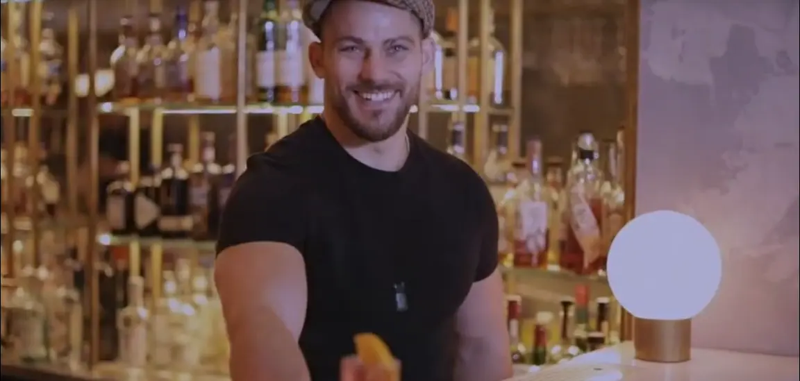
Crossip creates bold 0.0% spirits designed to bring depth, texture and complexity to drinks. Its proposition is not about pretending to be alcohol; it is about giving bartenders and drinkers a genuinely characterful alternative.
The digital challenge was to retain that confidence while making a growing product, recipe and stockist ecosystem easy to understand. The result needed the atmosphere of hospitality and the clarity of a high-performing store.
03 / Design direction
A restrained black-and-white foundation lets saturated product photography do the selling. Pale yellow accents, oversized type and modular line patterns create a visual signature without competing with the content.
A high-contrast editorial language, condensed type and expressive pattern work prevent the storefront from feeling like an off-the-shelf theme.
Flavour, serving ideas and purchase information sit together, helping each bottle feel distinctive without slowing the path to basket.
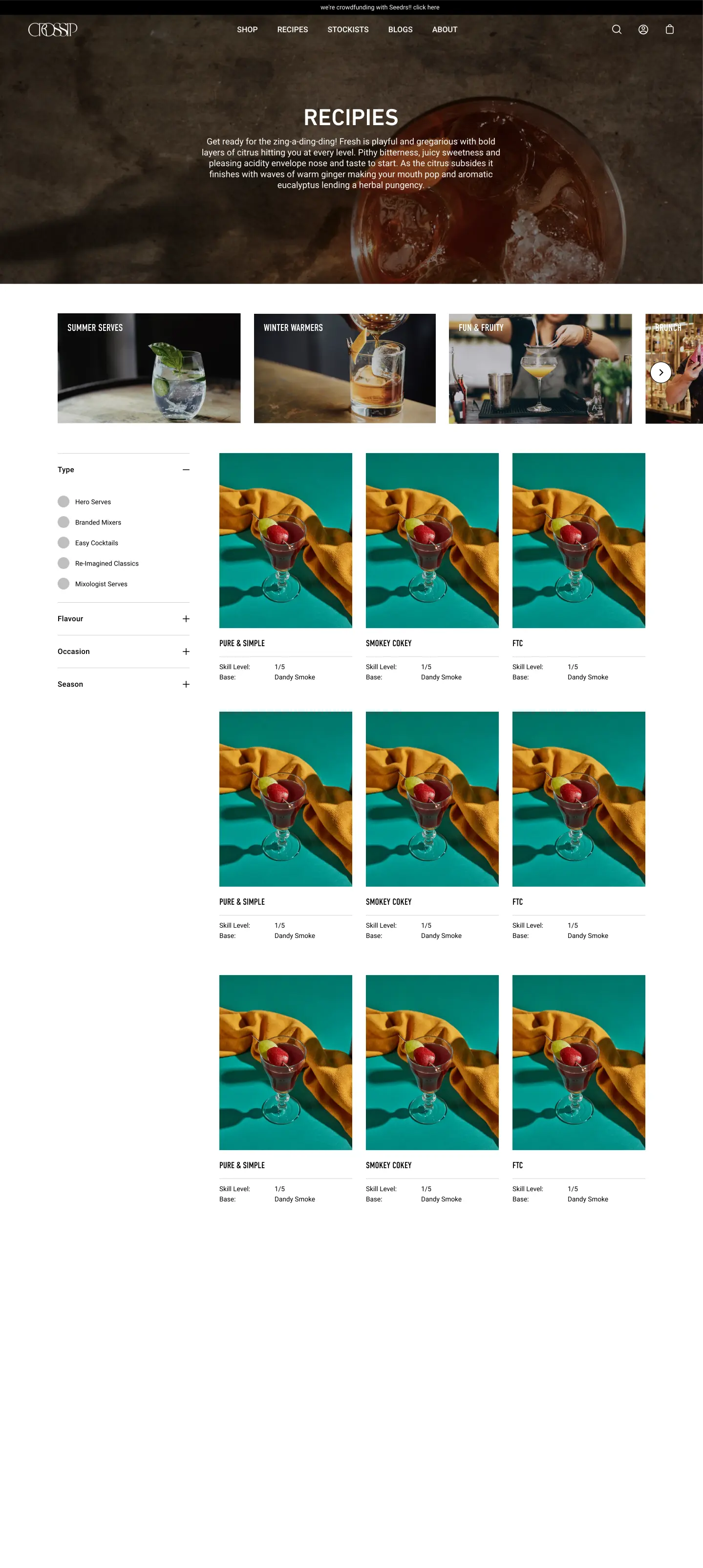
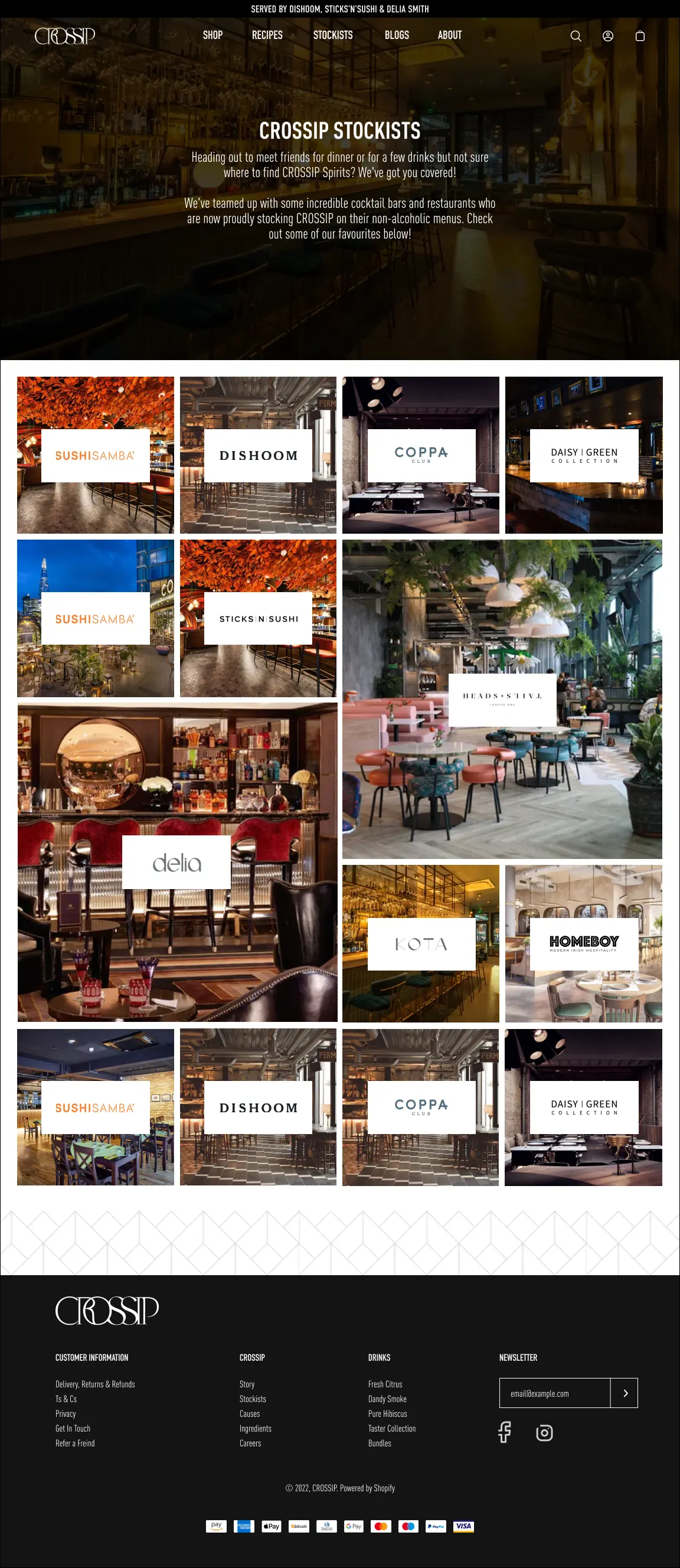
Recipes, stories and stockist discovery turn the site into a useful brand destination—not simply a product catalogue.
04 / Responsive storefront
Desktop and mobile were considered together. Hierarchy, product imagery and calls to action adapt deliberately, preserving the same confident reading rhythm rather than shrinking the desktop composition.
05 / Product experience
Product pages balance a direct purchase path with the detail a new category needs: flavour profile, serving suggestions, social proof and the wider range. The system supports discovery without making the buying decision feel complicated.
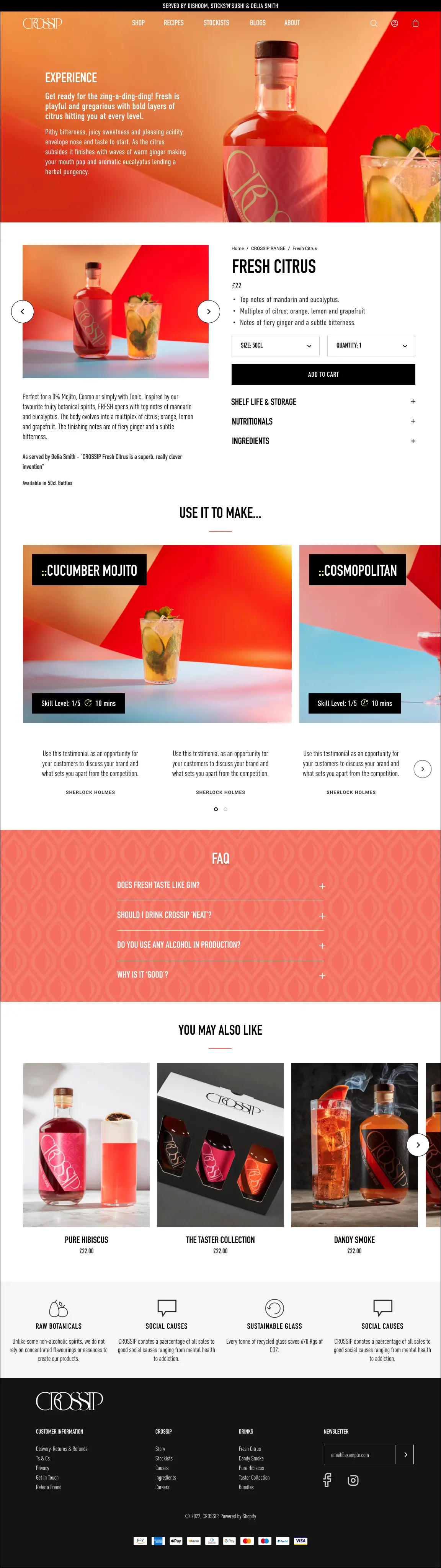 Product detail experience · Open full design
06 / Content ecosystem
Recipe discovery and stockist search give customers practical next steps. Their templates share the storefront's typography, spacing and interaction language while handling very different content needs.
07 / Design outcome
The work established a responsive visual and interaction system across commerce, editorial, recipes and stockist discovery. It gave the brand a confident digital expression while keeping the everyday journeys direct and usable.