Warmth with structure
A soft, natural palette and playful illustration carry the brand, while a disciplined grid keeps product discovery clear.
03 / Case study
A responsive redesign translating Nala’s Baby’s gentle, illustrated identity into clearer product, collection and content journeys.
01 / Context
Nala’s Baby already had an expressive visual world. The design challenge was to carry that warmth into ecommerce while keeping product discovery, reassurance and navigation easy to understand. The result is a flexible page system where personality supports the buying journey instead of competing with it.
02 / Visual system
Cream, clay and lilac create warmth; illustrated foliage and cloud forms add character; strong spacing and repeated content patterns keep the experience composed.
03 / Design principles
A soft, natural palette and playful illustration carry the brand, while a disciplined grid keeps product discovery clear.
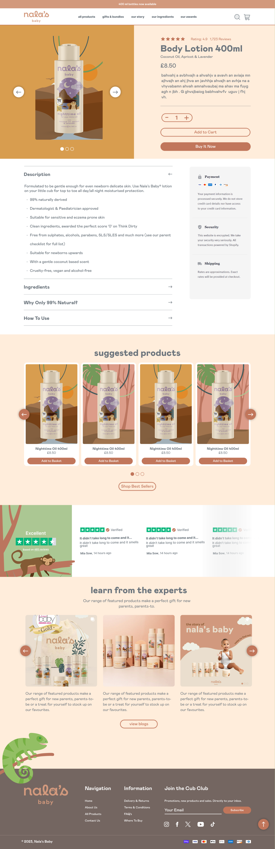
Ingredients, approvals, awards and product reassurance sit alongside the moments where families make decisions.
Desktop and mobile use the same content rhythm, components and visual cues rather than behaving like separate products.
04 / Responsive homepage
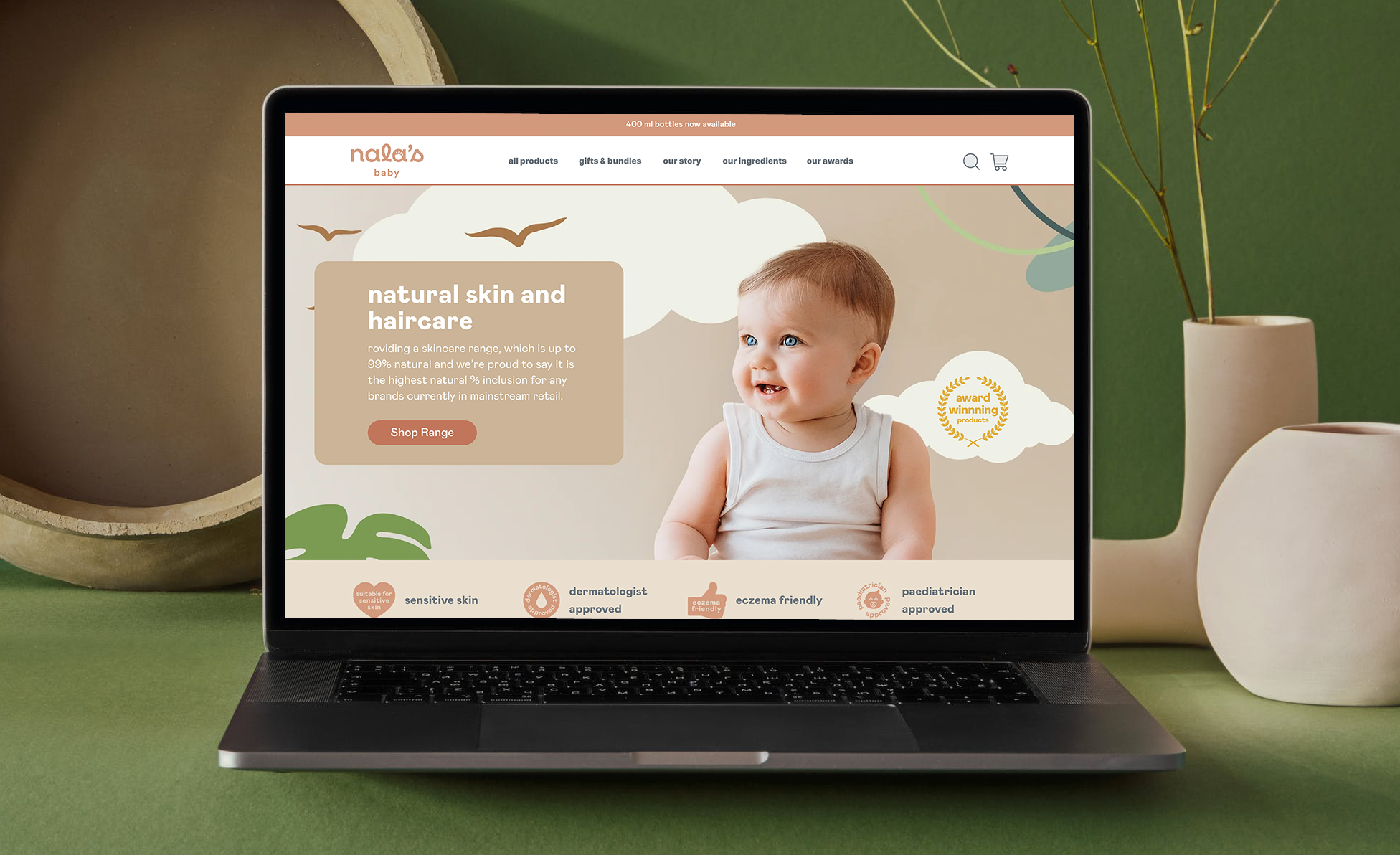
The homepage moves from brand introduction to ranges, ingredients, best sellers, awards and editorial content in a deliberate rhythm. Mobile preserves that sequence while giving every message enough room.
05 / Commerce journeys
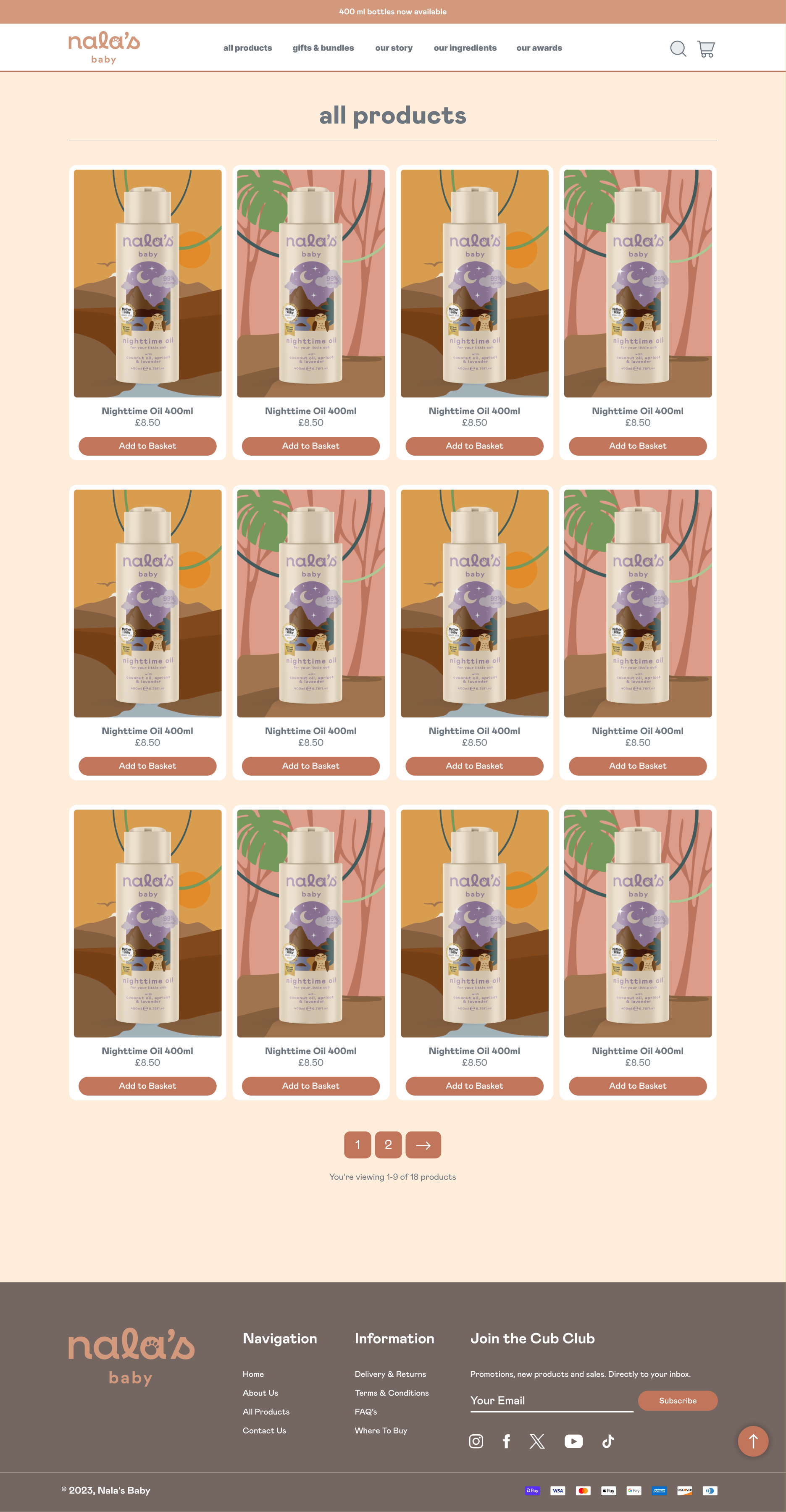
Collection and product templates use one modular language for filtering, product comparison, ingredient detail and supporting brand content.
06 / Brand story
The About experience extends the same design language into brand purpose and supporting information, so trust can build beyond a single product page.
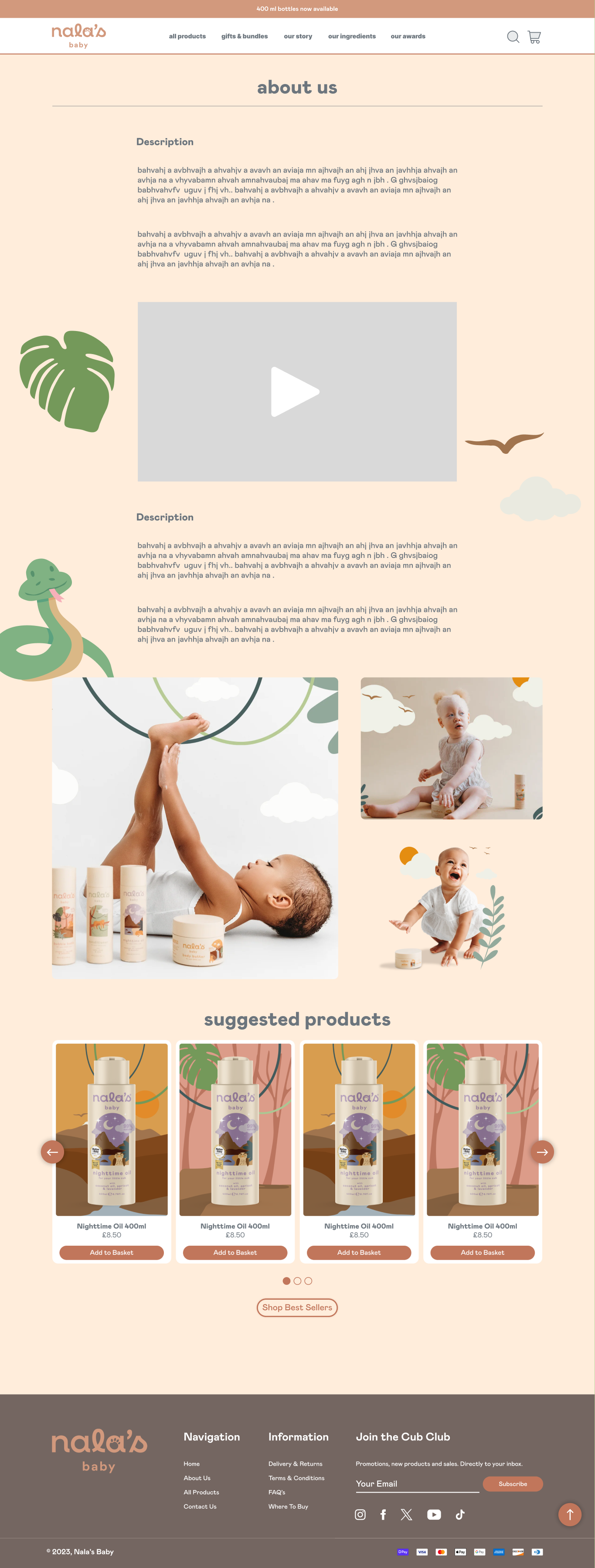 About page · Open full design
07 / Design output
The final design brings the principal shopping and storytelling journeys into one reusable visual system, with paired desktop and mobile layouts ready to guide implementation.