Understand how users interacted with the closest competitor's website, then use the findings to improve the existing Bonmarché experience and assess the feasibility of a new site aimed at a slightly younger audience.
10 / UX research · Ecommerce
Turning customer evidence into a clearer retail experience.
While I worked at Squashed Pixel, a leading Shopify and ecommerce design agency based in the North of England, I was tasked with designing and collaborating with developers and project managers on a focused UX study for Bonmarché using the Country Casuals website.
01 / The brief
A focused study, not a speculative redesign.
Bonmarché requested a short UX study based on a competitor ecommerce website. The work combined market review with direct user evidence, then organised the resulting observations into a structured basis for information architecture and wireframing.
Six participants aged 18–60 took part in the study: four women and two men.
02 / Evidence-led process
From market context to design direction.
The study follows a traceable sequence. Each design output should be supported by an observation, research theme or structural requirement rather than personal preference alone.
Benchmark the market
Review comparable ecommerce experiences to identify established patterns, points of difference and areas that warrant closer investigation.
Listen and observe
Use interviews and usability sessions to capture what participants say, what they do and where the two do not align.
Find the patterns
Organise observations through affinity mapping so recurring themes can be separated from isolated comments.
Shape the structure
Translate the evidence into clearer journeys, information architecture and wireframes that can be reviewed before visual design begins.
03 / Competitor research
Understand the category before changing the journey.
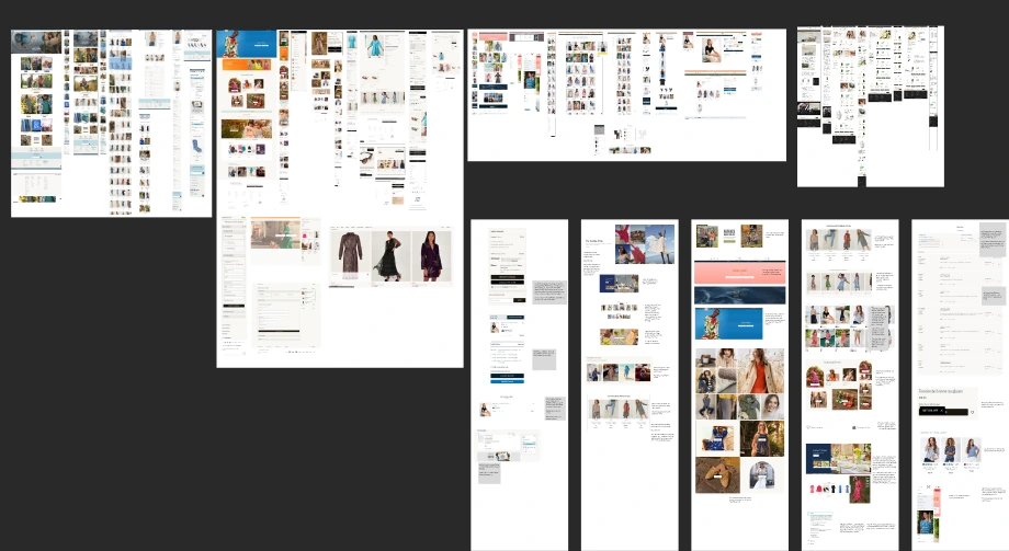
The benchmark brings together online competitor research, comparative interface references and a price architecture view. It establishes how comparable retailers organise discovery, product evaluation and purchasing information, creating context for the user research that follows.
Remote usability test · Session excerpt 01
Mobile product discovery on the Monsoon website.
A moderated remote session observing how a participant navigates a competitor's mobile ecommerce experience. The recording is presented as research evidence and plays only when selected.
04 / Interviews and usability synthesis
Turn individual observations into recurring themes.
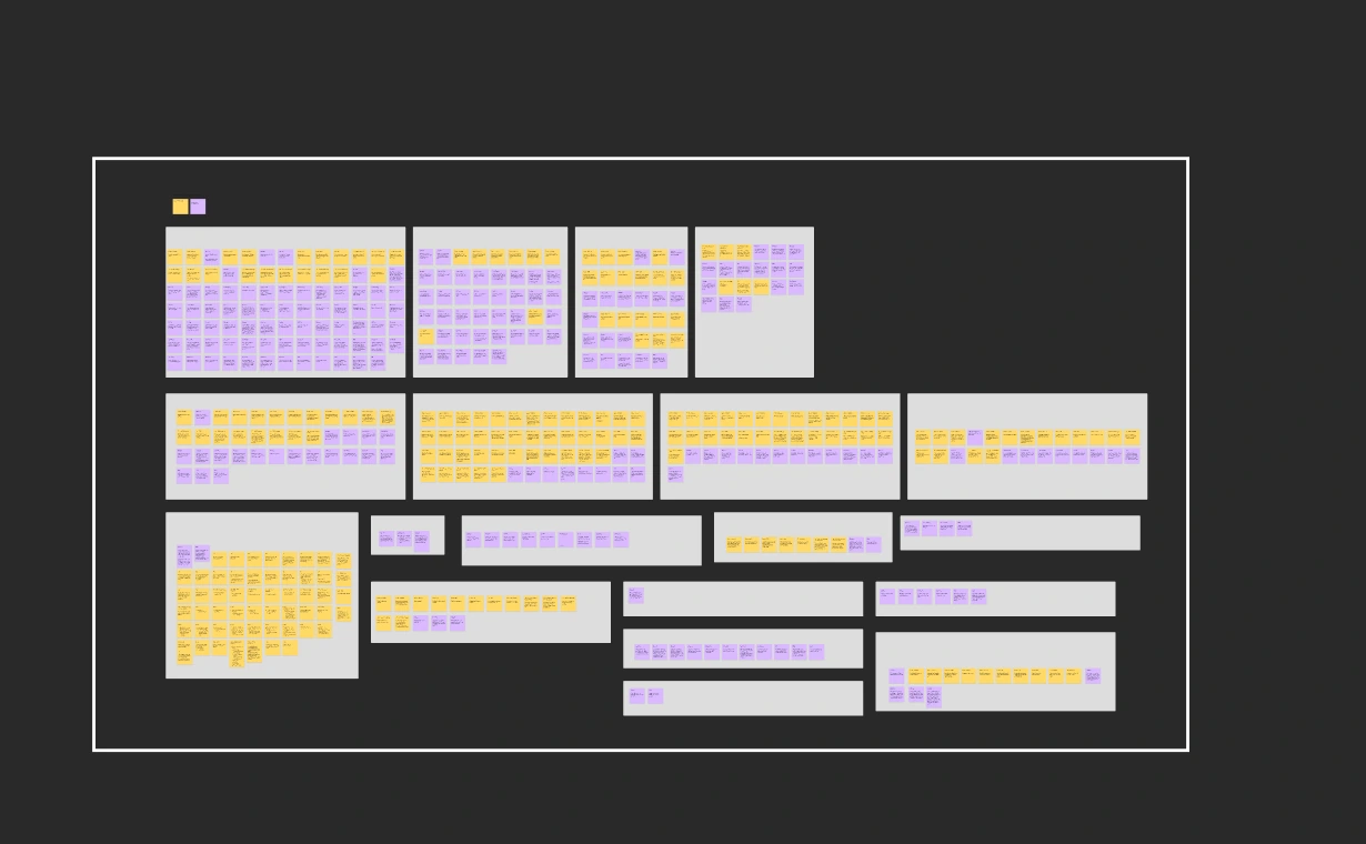
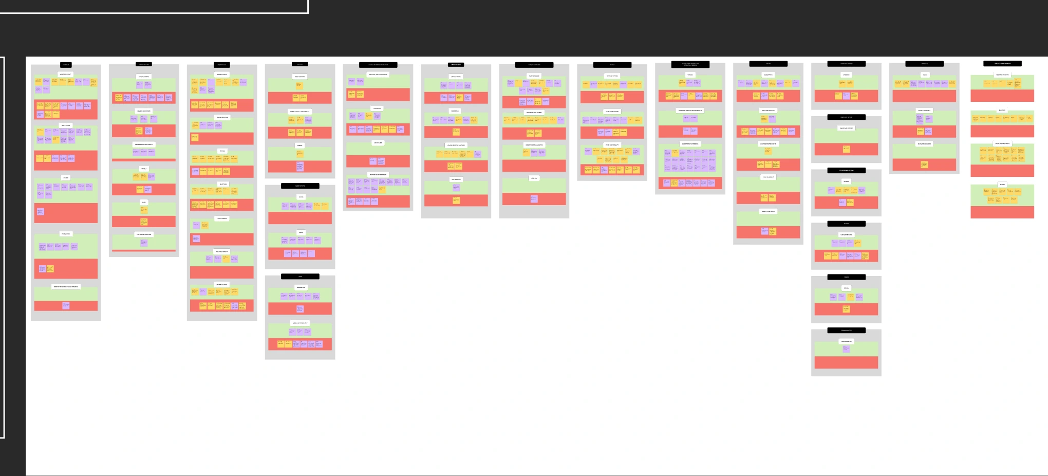
Findings from the user interviews and usability tests were organised in affinity diagrams. Grouping related observations makes patterns visible, helps distinguish evidence from opinion and creates a defensible bridge between research and later design decisions.
05 / Architecture and wireframes
Resolve the journey before applying visual polish.
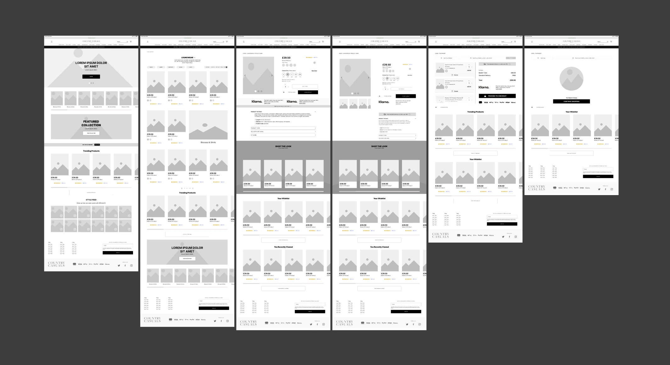
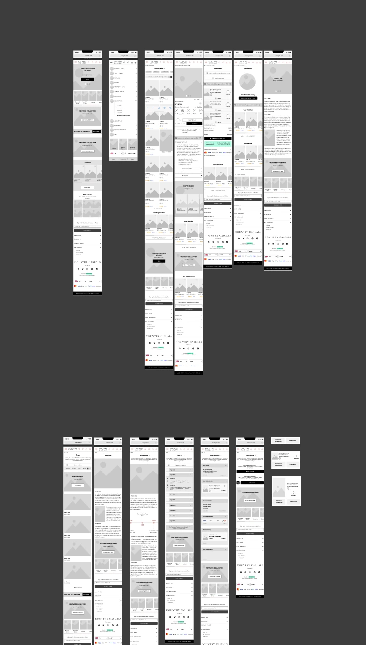
The wireframes explore the main ecommerce page types and their relationships across desktop and mobile. They provide a shared, low-risk format for reviewing hierarchy, content requirements and interaction before progressing to detailed interface design.
06 / What this provides
A practical research service for more successful products.
For a client, this approach reduces the risk of designing around assumptions. I establish the competitive context, learn from real user behaviour, organise the evidence and turn it into clear, testable design direction. The result is not research for its own sake; it is a better-informed product structure with a visible rationale behind the decisions.
- Research objectives and an appropriate study plan
- Competitor benchmarking and experience review
- User interviews and task-based usability testing
- Affinity mapping and prioritised findings
- Journeys, architecture and responsive wireframes
- Validation recommendations and next-step priorities